Transforming a Crowdfunding Platform into a More Trustworthy and Scalable Product
ChangeChanges 犀犀公益 | Taiwan
My Role
Senior Product Designer & UX Consultant
Team
PM, dev team
Outcomes
Secured follow-on engagement based on project success and client satisfaction
Overview
ChangeChanges (犀犀公益) is Taiwan’s premier accountability-focused public welfare crowdfunding platform. The platform ensures absolute transparency via detailed accountability reports and progress tracking, transforming micro-donations into verified social impact while helping companies achieve their ESG goals through volunteering initiatives.
Problem
My client reached out with the first version of their website, which felt outdated and lacked design polish. They needed a professional designer to lead an end-to-end redesign.
After conducting a UX audit, I identified several major issues, including:
01
Visual design felt outdated and lacked a modern aesthetic
02
Inconsistent UI patterns and brand identity
03
Failed to convey the ChangeChanges crowdfunding platform’s core values—transparency and accountability

My design objectives
My design objectives
Defined the visual design for the client’s website and redesigned key pages and flows
Improved donor trust
Built design systems
Visual style exploration
Approachable & engaging
I created two visual style directions after exploring brand values and visual preferences with my client: one professional and clean, and the other approachable and engaging.
During review sessions, we evaluated both options against the brand values, mission, and stakeholder feedback, and ultimately chose the approachable and warm direction.
How did I make the visual language approachable and engaging?
Designed with mascots
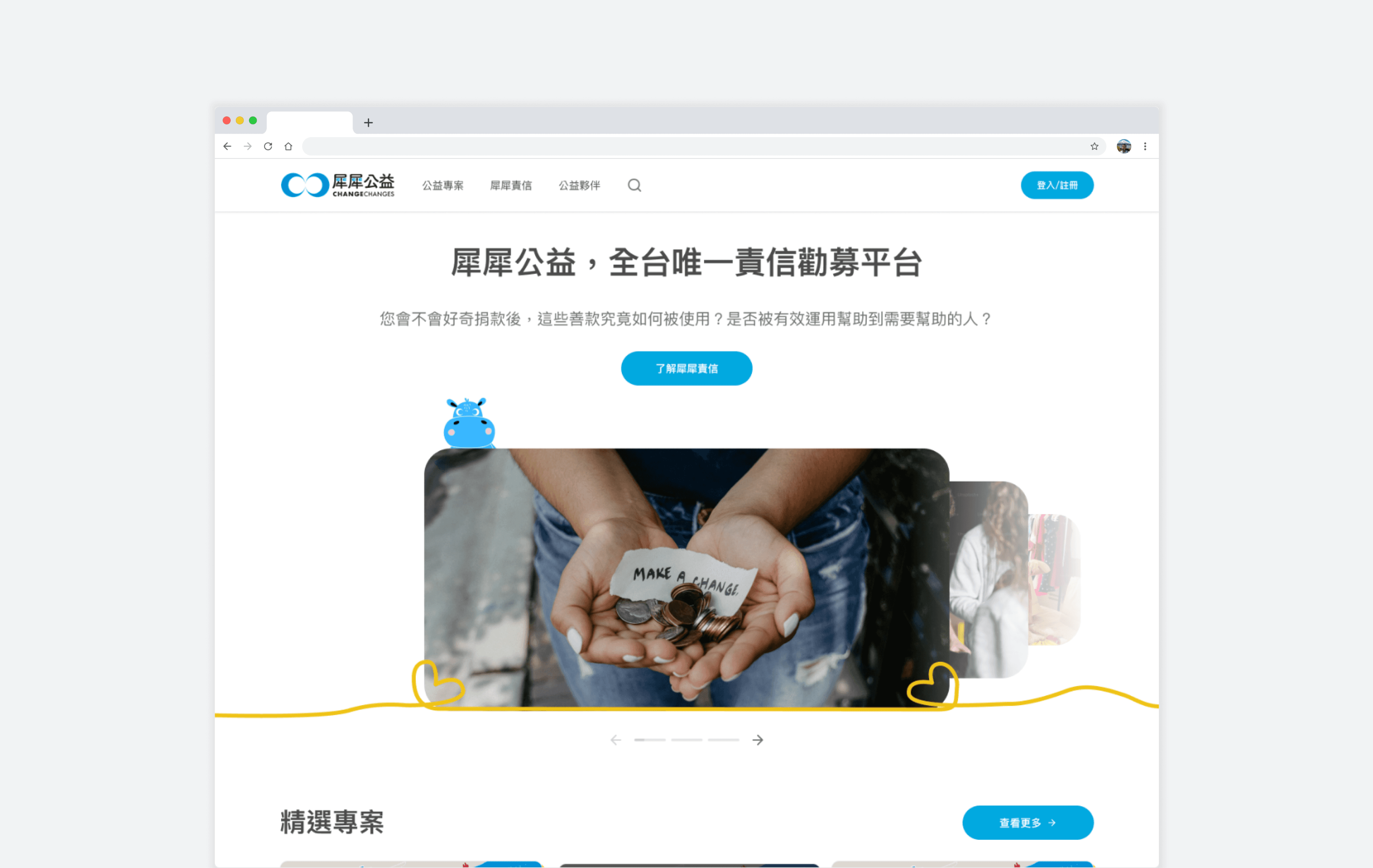
My client had already created several mascots, with the main character being Xibao (犀寶), a rhino figure representing courage and resilience. I created various variations of Xibao to use across different pages and scenarios.


Used curved lines and hand-drawn scribbles
Created hand-drawn scribbles to decorate the hero slider and serve as design patterns, making the overall look feel more approachable

Used rounder corners and organic shapes
Designed all cards with rounder corners and used organic shapes across the footer, avatars, and imagery


Key design improvements - improved donor trust
Demonstrated ChangeChanges’s core values
Demonstrated how ChangeChanges crowdfunding platform would ensure transparency and reliability of project campaigns by uncovering accountability reports and progress tracking
Before

After


Showcased campaign momentum and social proof
Differentiated donor roles (individuals and companies), and displayed donor testimonials and key stats about campaigns to build credibility and trust


Increased the visibility of the advisor team
Designed a dedicated page explaining how the platform kept creators accountable and featuring the advisors to further build trust

Built design systems
Background
When my client reached out, there was no Figma design file, which meant there were no defined styles or components. UI components were also inconsistent across the site; for example, there were five different button variants on the homepage.
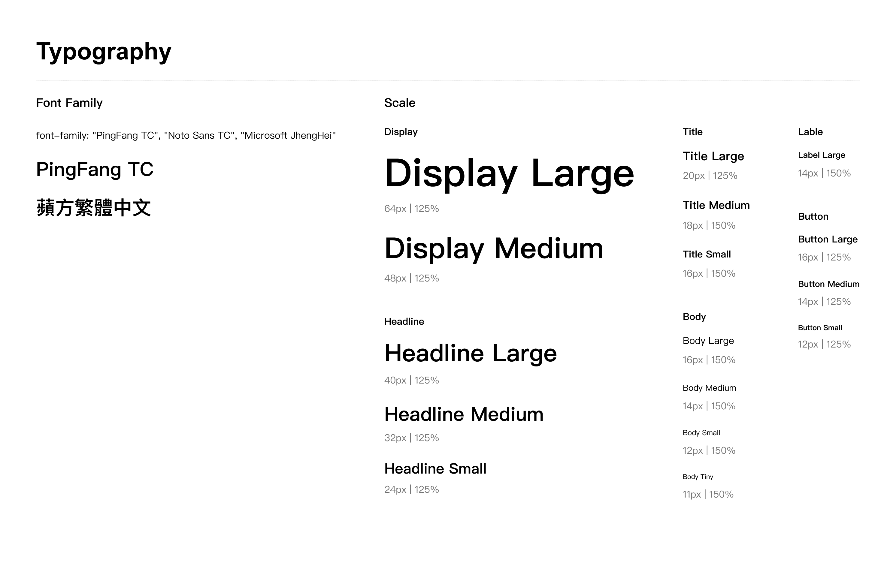
My goal was to build a scalable and adoptable design system that would streamline and improve the efficiency of the design process.