Increasing Course-Detail CTR by 65% through App Redesign
Snapask | Asia

My Role
Product Manager
Team
Impact
Overview
Snapask connected K–12 students with quality tutors for instant 1-on-1 learning support, and it also offered online courses covering most subjects and grade levels. Snapask operated across nine Asian markets, supporting over 3 million students and more than 350,000 qualified tutors from top universities.
Problem
Business problem
As our business strategy evolved, we shifted from an all-you-can-watch subscription model to one-off payments for our content offerings: Course and Regular Class. We also deprioritized Quiz and scheduled it to sunset. As a result, the current information architecture was no longer relevant.

User problem
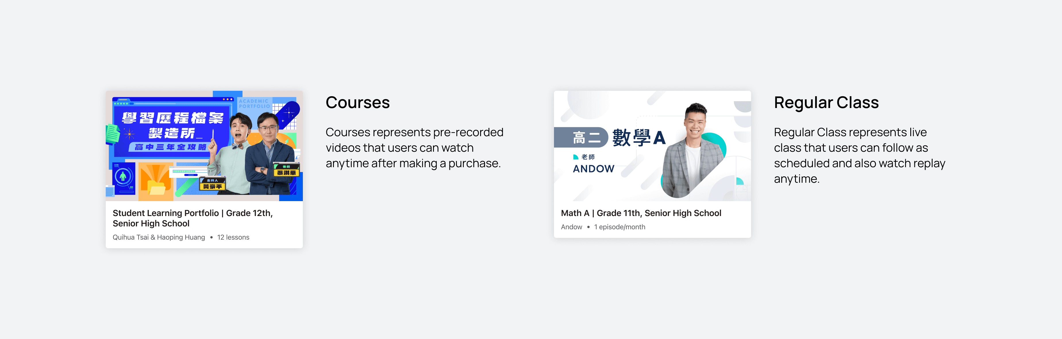
Users struggled to distinguish between Course and Regular Class because both were delivered in video format.
Users couldn’t find relevant content easily because we didn’t offer subject and grade-level filters.

Objective
How I approached the problems
01
Revamp the app’s information architecture to support the updated sales strategy and sharpen the product offering focus
02
Make content more relevant and personalized for users
03
Clearly differentiate Course vs. Regular Class and communicate each one’s value proposition
Information architecture revamp
Initial thought
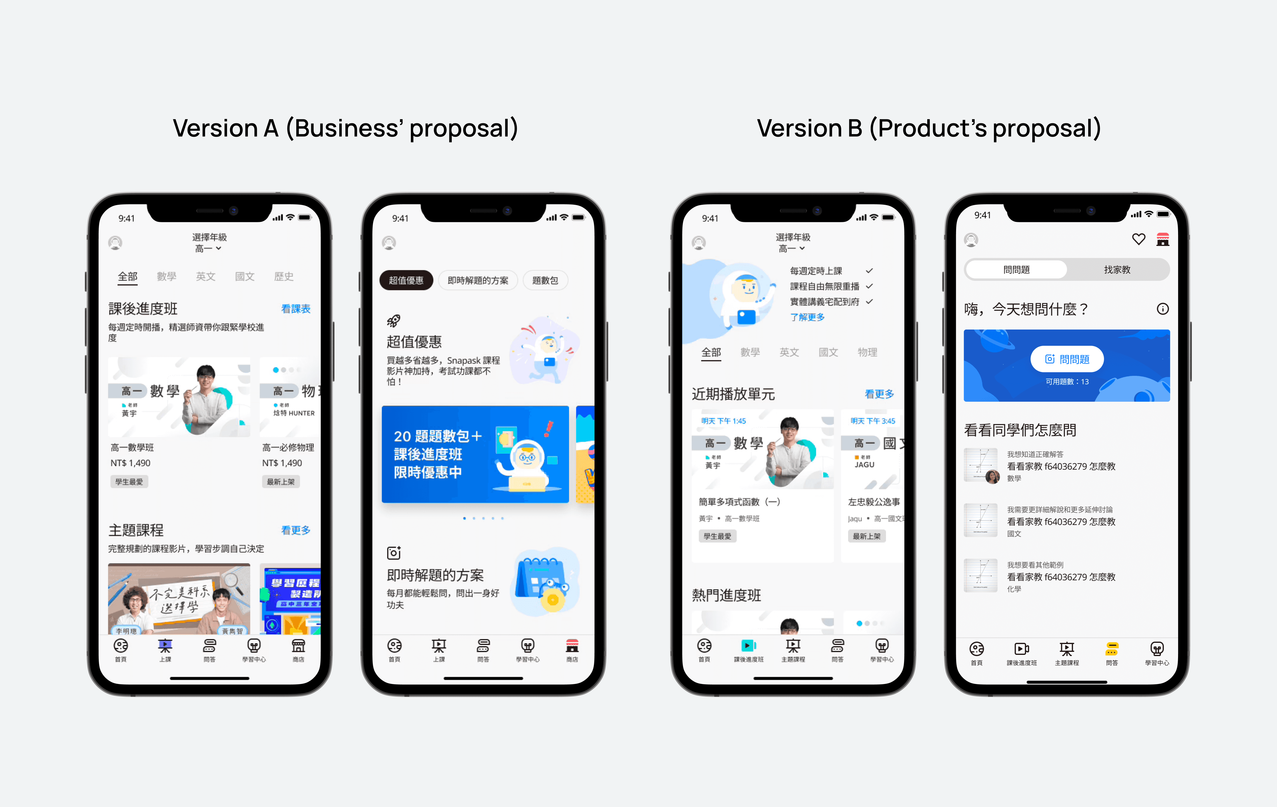
Initially, the nav bar had five tabs: Home, Watch, Ask, Practice, and Shop. We combined Course and Regular Class under one tab, Watch, but received feedback that users had trouble distinguishing between Course and Regular Class.
So I proposed giving each offering its own tab — one for Course and one for Regular Class . Since the Shop page only contained QA token plans, I suggested folding Shop into the Ask page instead, giving us a new nav structure: Home, Course, Regular Class, Ask, and My Learning.

However, the business team was concerned that moving Shop inside the Ask page might make it harder for users to find and buy tokens.
Since we couldn't reach an agreement, I suggested creating two design variants and running usability testing to see which version users preferred.
Usability testing insights
Discovered what users truly thought
Version B was better
80% of participants found it easier to distinguish Course and Regular Class in version B than in version A. They also preferred version B because it felt less salesy without a Shop tab in the nav bar.
Shop icon was confusing
However, in version B, 80% of participants thought the Shop icon wasn't visible enough, and some didn't understand what it represented.


Design revision based on research insights
Revised design based on version B
We went ahead with version B, but revised the Shop icon by adding the label "Top up" and changing the icon itself, which users found clearer.

Added grade level and subject filters
We reassured that when it came to K12 learning, users were goal-oriented. For instance, if they were at grade 10 and wanted to improve their English, they would want to find relevant courses right away unlike e-commerce shopping experience.

Other things to consider
Localized design based on each region's product stage
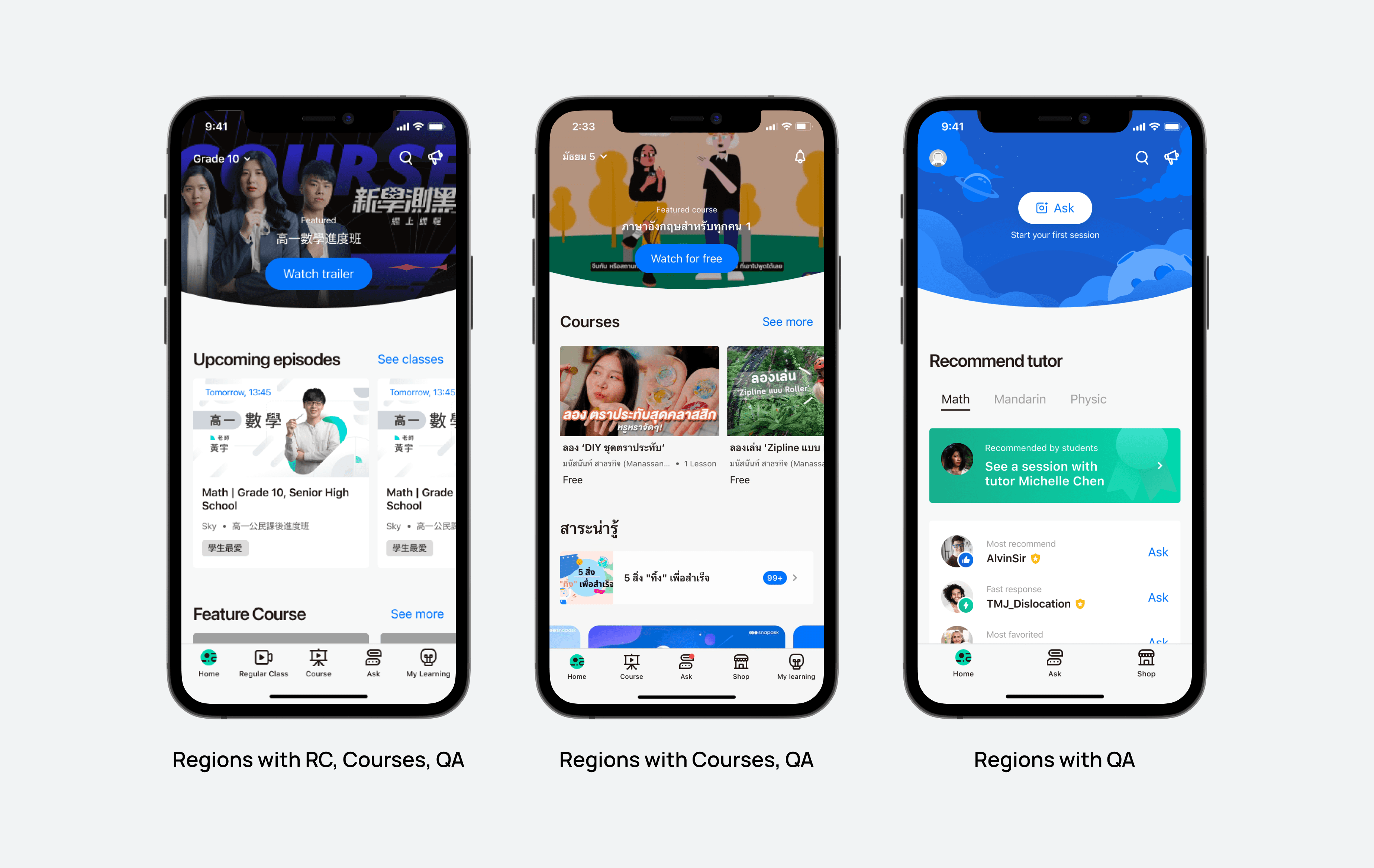
We needed to consider each region's product stage, since not all regions offered Course or Regular Class.
Regions with all offerings (Course, Regular Class, QA): Taiwan, HK, Singapore
Regions with Course and QA: Malaysia, Thailand, Japan, Korea
Regions with QA only: Vietnam, Indonesia